Artful Robot provides tools, support and interactive presentations for the People & Planet University League

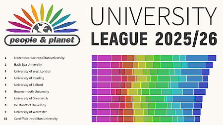
If you've not met this wonderful project yet, explore the league current tables, it's an incredible long-running project that has been crucial to driving sustainability practices in UK Universities by ranking their policies and performance. It's published annually, usually in the Guardian.

It does this by using dozens of volunteer researchers, many of them students themselves, as well as People & Planet's own staff experts and me, to collect, assess and present hundreds of data points from university websites, local knowledge and public reporting bodies. Student groups and sustainability staff can use this to identify and justify where each university can make its next improvement.

A screenshot of the first few unis in the league. There's the People & Planet University League 2025/26 logos and a colourful stacked barchart.

Artful Robot's role

  • Developing and providing tools: All the data you see on the website lives in their CiviCRM database. It's presented by a custom Inlay extension, providing an interactive view of the data on their separate ProcessWire website. A survey extension called Hark was developed to handle the teams of volunteers, staff, and university staff who all need varying levels of access to various bits of the survey at various times. It includes tools for imports, exports, calculated fields and reporting. (As a fun extra, you can use it for website polls, too.) The beauty of Inlay is that a couple of years ago, they used Drupal for their website and it lived on that, just as easily.
  • Data manipulation skills to extract/calculate what we need from various sources. As well as using the excellent open source spreadsheet, LibreOffice Calc, this process also includes some programmatic filtering/transforming of the data as it doesn't come in a readily-usable form.
  • Consultation on metrics: I developed a metric to fairly compare universities' year on year efforts to reduce carbon (see carbon intensity change methodology); when you are comparing a sector as diverse as this, with tiny arts unis and giant engineering unis, you can't just go on carbon emissions for a rank-able comparison. Each year I am involved in the process of determining appropriate scores based on the sector's data that year.
  • Making information beautiful. I developed the interactive animated chart and 'score card' pages to make a visually stunning, informative and interesting presentation of the data. For the score card pages I provided a way for their staff to make a template to present the different data.
  • Design skills, asset production. Each year needs a new set of graphics, logos. I use Inkscape to design and produce these.

PS. I also designed, migrated and maintain People & Planet's website. I have a blog on how I chose ProcessWire for that site. ProcessWire is also the CMS used for this site.